Each new quarter, you will be given graphics that need to be redesigned for the new training courses being made by the Learning Development team. Graphics provide extra clarity to the end user and help beautify our training courses.
Time Management
At the beginning of each new quarter, you will be given a list of the new courses that will be written. Eventually, graphics will be sent to you concerning each of these topics.
When you know the training topics for the quarter, you are welcome to look through the old training course to get an idea of which graphics they will be sending you to redesign.
If a brand-new training is being written that we do not have any previous graphics for, research a little bit about the topic. This will help you see what resources you may need when the graphics come to you in the next few weeks.
The From Writers to Media Channel
In Microsoft Teams, there is a channel called From Writers to Media. This is where writers will be able to communicate with you about graphics. When they are ready for you to start redesigning graphics for them, they will send a message in this channel.
Once you get that message, you are free to begin working on all the graphics! The PowerPoint they create should include all of the information you need to make the graphic. If you have additional questions, you can ask for clarification face-to-face or over chat or video call.
Note: You can access the PowerPoint and review it here:
01-Training Topics > [Training Category] > [Training Topic] > 2_design > From Writers (temp).
Creating the Graphics
We want you to have creative freedom with all the graphics you create. However, there are a few guidelines for you to follow in order to maintain our brand image and ensure the graphics can be used on a variety of devices. Consider each of these questions when making a graphic:
- What aspect ratio should I use to ensure this graphic will fit the frame of the PowerPoint slide it will appear on?
- Are the colors I am using consistent with the Safety Provisions or Hard Hat color scheme?
- Does the color of the graphic and the color of the text allow for maximum readability? (Reminder: all these graphics will be on a white background that is on a black and orange PowerPoint slide)
- Can the end user read this graphic on a mobile phone? Can they read it on a desktop or other portable devices?
Important: Do not use rounded corners, and always keep the font size above 25 pt.

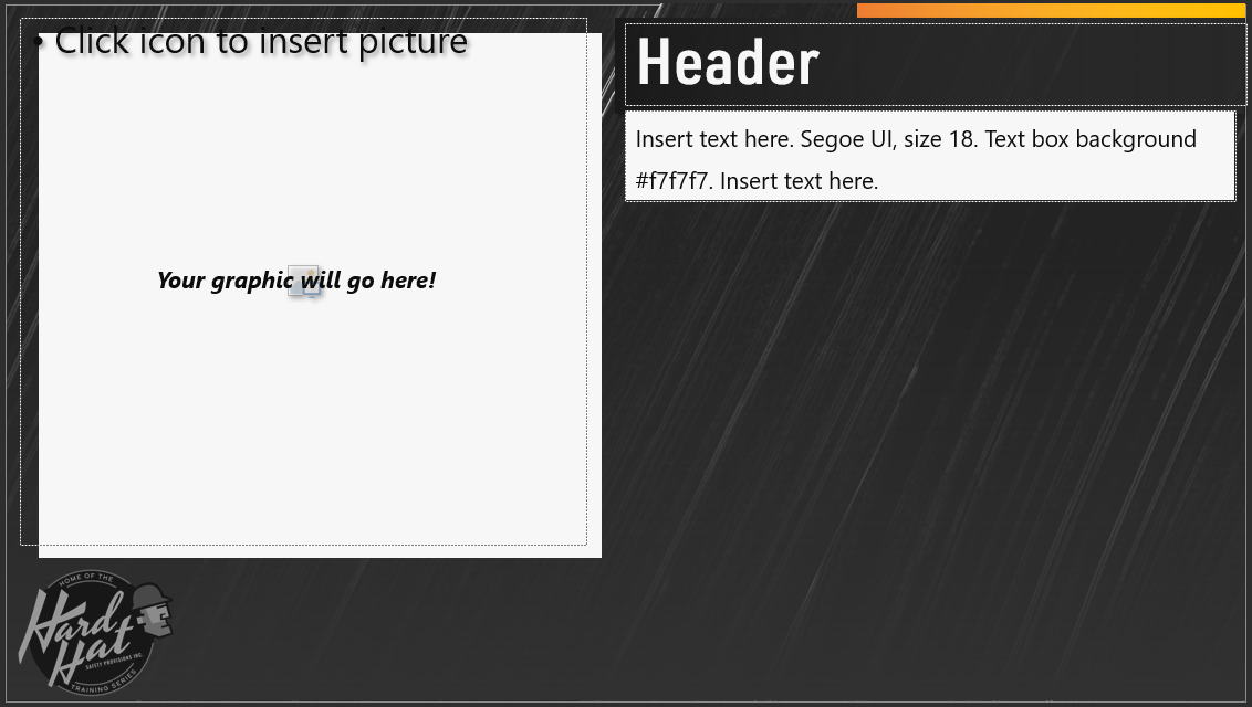
Your graphic may be configured for many different slide layouts. In the PPT that the writers give you, they will include a screenshot of the slide where the graphic will go. This one is shown to help you see the colors and background of where your graphic will be placed.
Finishing up the Graphics
Once you have finished making the graphics, export the PNGs into this folder: 01-Training Topics > [Training Category] > [Training Topic] > 2_design > Graphics > Exports.
Next, share the file path with the writers in the From Writers to Media channel so they can review your work. Once the writers have looked over the graphics for a few days, they will set up a review meeting. Together with the writers, your manager, and the writing team manager, you will review the graphics and make any needed adjustments before they are finalized and published in our new training courses.
Save all finalized project files into this folder: 01-Training Topics > [Training Category] > [Training Topic] > 2_design > Graphics > Files.
Note: Keeping the project files allows you to change graphics easily if the writers request changes. It also allows you to access graphics you may have made previously if someone requests similar graphics in the future.
Comments
0 comments
Please sign in to leave a comment.