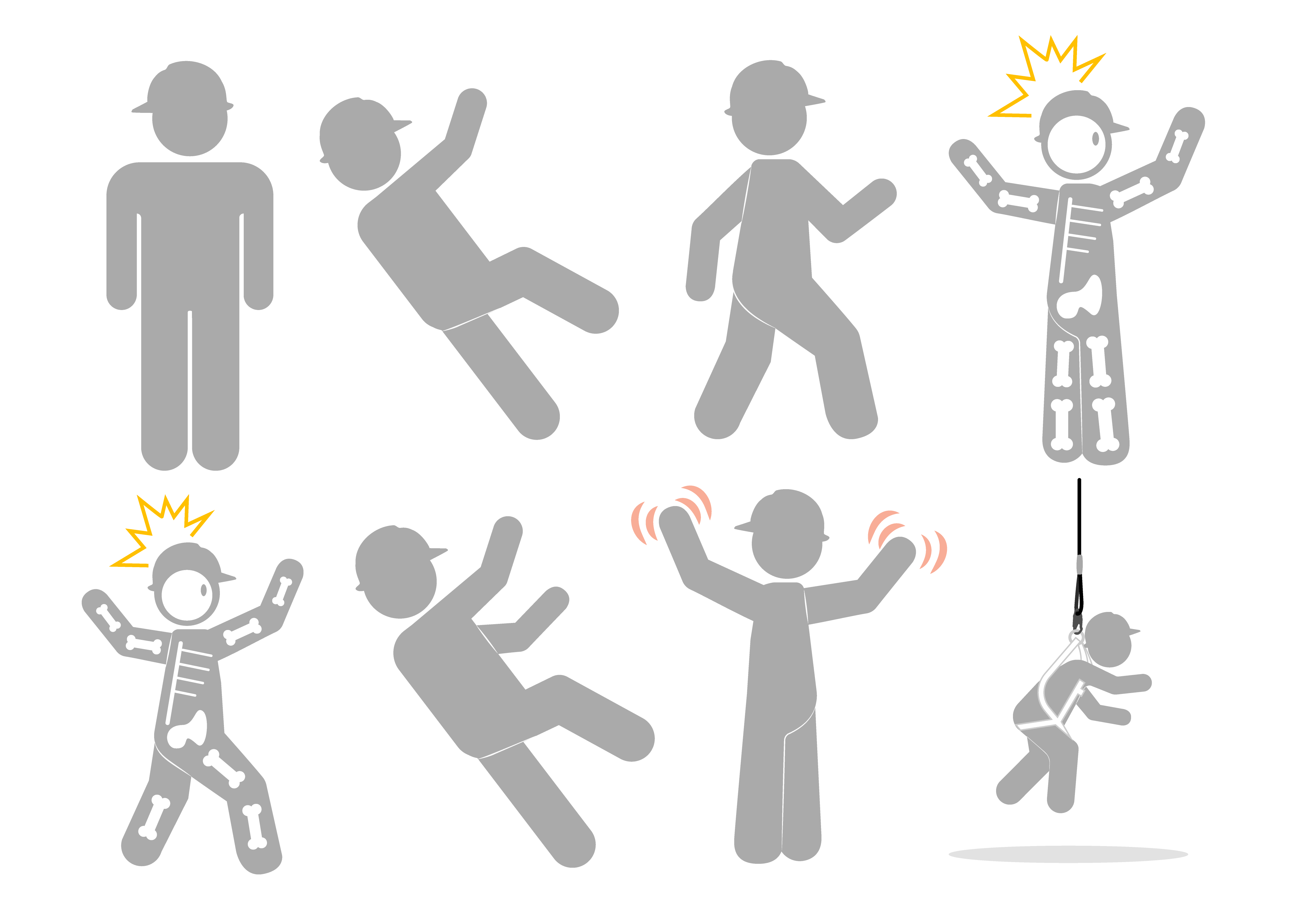
This article covers some of the visual elements that commonly appear in our training materials. These elements are recognizable to our end users as part of the Hard Hat Training brand. Check out each of these branded elements to know how they can be used and where they can be found.
Stick Figure ManThere are many types of stick figures across different types of branded media. For consistency purposes, this is what the stick figure man we use looks like. You should try to approximate this figure any time you include images of people in your graphics. He should always be within the grayscale (any shade of gray, white, or black) and is always portrayed with his hard hat on. He can be posed in any way you may need him, and you can even add a skeleton if needed (like shown). This may help to demonstrate some hazards, like electric shock or other bone-rattling hazards. You can find templates and project files for the stick figure here: M: > 02-Frequent Use > Designs > Graphics > Premade Assets 1 |
 |
Graphic Color PaletteWhile you will most often be using branded colors from the Corporate Style Guide, we have provided this extra color palette for you to reference when creating graphics. Having this color palette allows us to create trees using consistent colors, for example, or to keep skies the same shade of blue. You can use the hex code provided in the image to match the colors in the circles. Refer to the Color article in the Corporate Style Guide for our company's primary color palette. |
ArrowsThere will probably be many instances where you will need to use arrows to highlight different parts of a machine or object. To point out a certain element in your graphic, use the arrow called "Arrow #9" in Adobe products. Do not use curved arrows to label parts of things. Always write the label text above the arrow as shown below. The curved "Arrow #7" can be used to show movement. This arrow can be used to illustrate movement or other concepts that do not involve labeling specific parts. |
Here are a few examples of how these arrows have been used.
Background Colors
For most graphics, you should use a white background, unless you are building a scene with a particular setting. Make sure that the background of your graphic does not blend in with the background of the PowerPoint presentation, which is black in all Hard Hat Trainings. If the design already contains white shapes that might be hard to see against a white background, you can change those shapes to an off-white shade so that they stay visible. The hex code for white is: #FFFFFF.
TablesOur trainings often require the use of tables. When making a table, be sure to use company colors. For the most part, your table should look like the one shown to the right. You can also use the image found in this folder as a reference: M:\02-Frequent Use\Designs\Graphics |
In addition to these main elements that are connected with our brand and have requirements set for use, there are also a variety of other elements that you may need or come across as you create graphics. Here are two more articles that contain information about elements you are welcome to use and adjust in whatever way you feel is best for your project:
Comments
0 comments
Please sign in to leave a comment.