The company logo is a critical part of our brand. It should be used thoughtfully and consistently, no matter where it appears. This article contains all of the official versions of our logo that are available for you to use.
Since the company's beginning, our brands have gone through many different logos. This article will focus on the most current logo for each brand. As the brands continues to evolve, the logos may as well, but you can always refer back to this article for updated information. Similarly, you may ask the media department specific questions.
Each time you use a logo, be sure that you have created adequate space around it. Imagine a box around each circle logo or a rectangle around each variation to envision how much breathing space is needed.
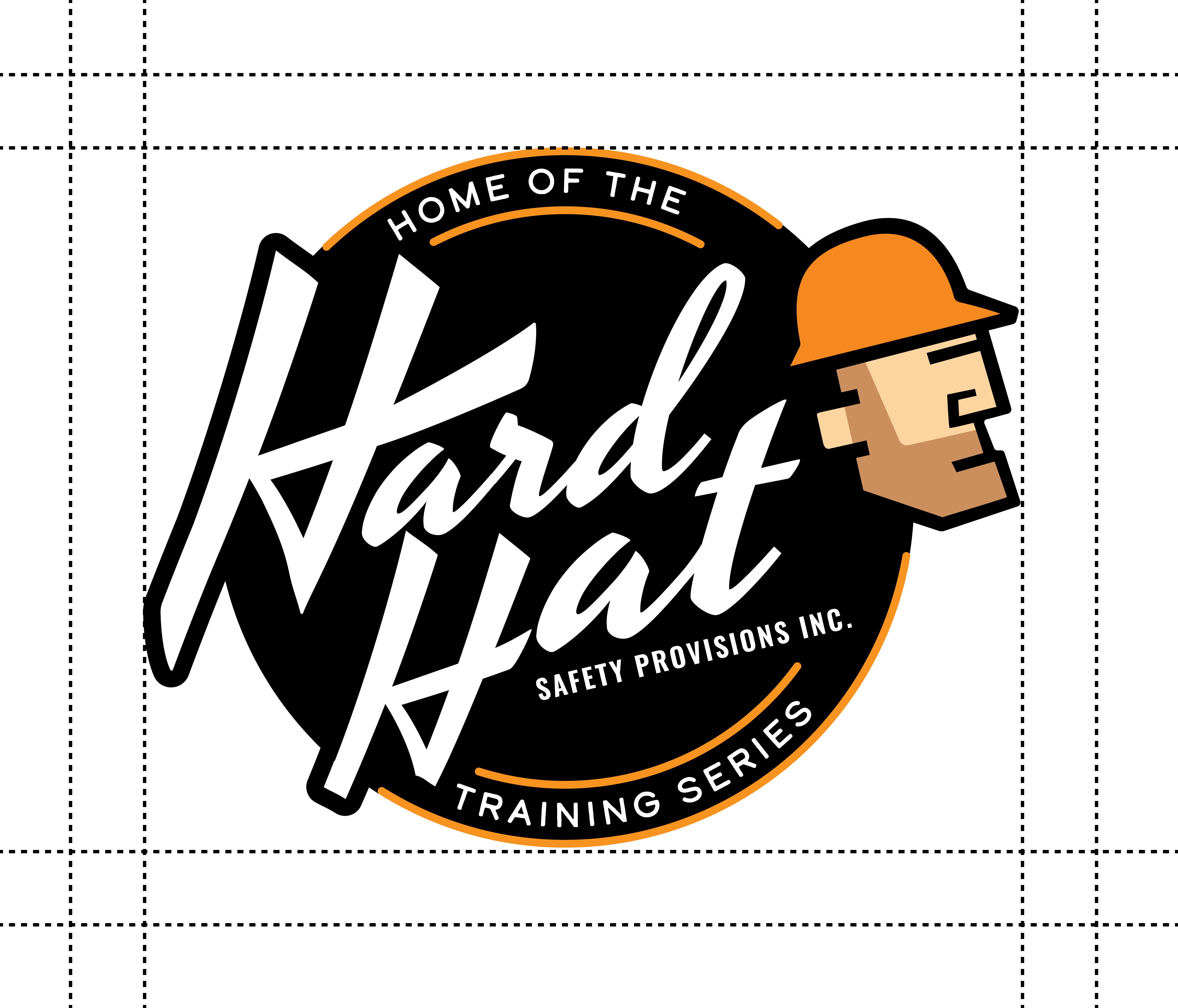
Note: If you have questions about a version of the logo that does not appear in this article, your first step should be to consult the media department. All the logos can be found by following this file path: M: Drive > Company Use > Management > Designs > Logo & Business Identity
Hard Hat Training Logo
| Primary Logo | Variation Logo |
 |
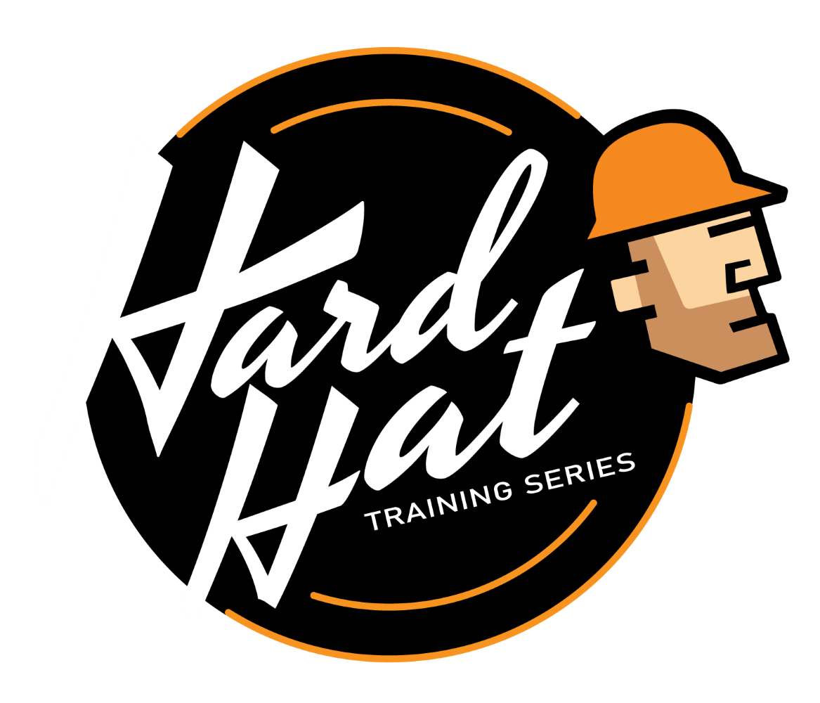 |
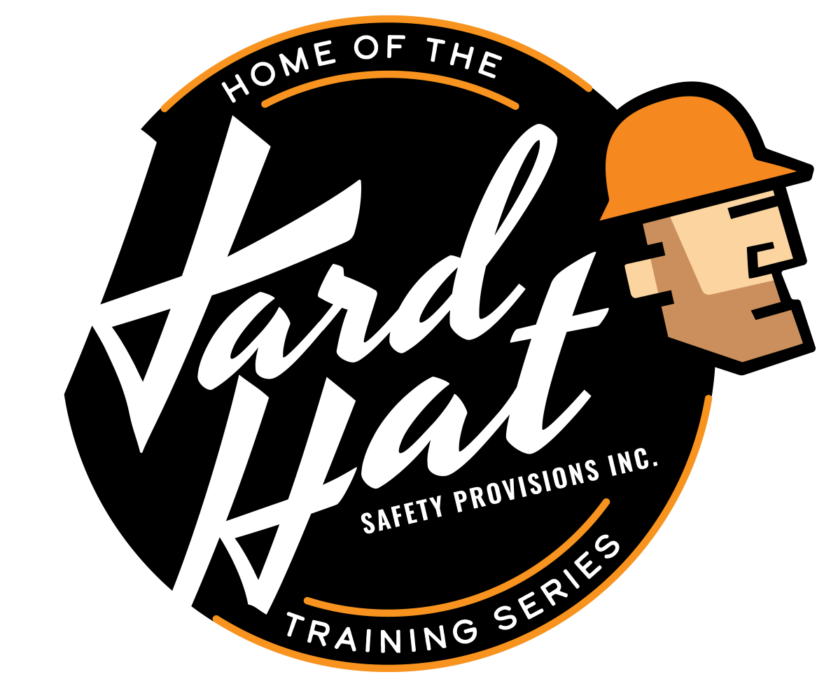
| The primary version of the logo contains the words HOME OF THE and TRAINING SERIES. It is our official logo. Use the variation in place of the primary logo when it needs to be smaller than 300 px, or if you want there to be less text overall. | |
| Primary Logo for white backgrounds | Variation Logo for white backgrounds |
 |
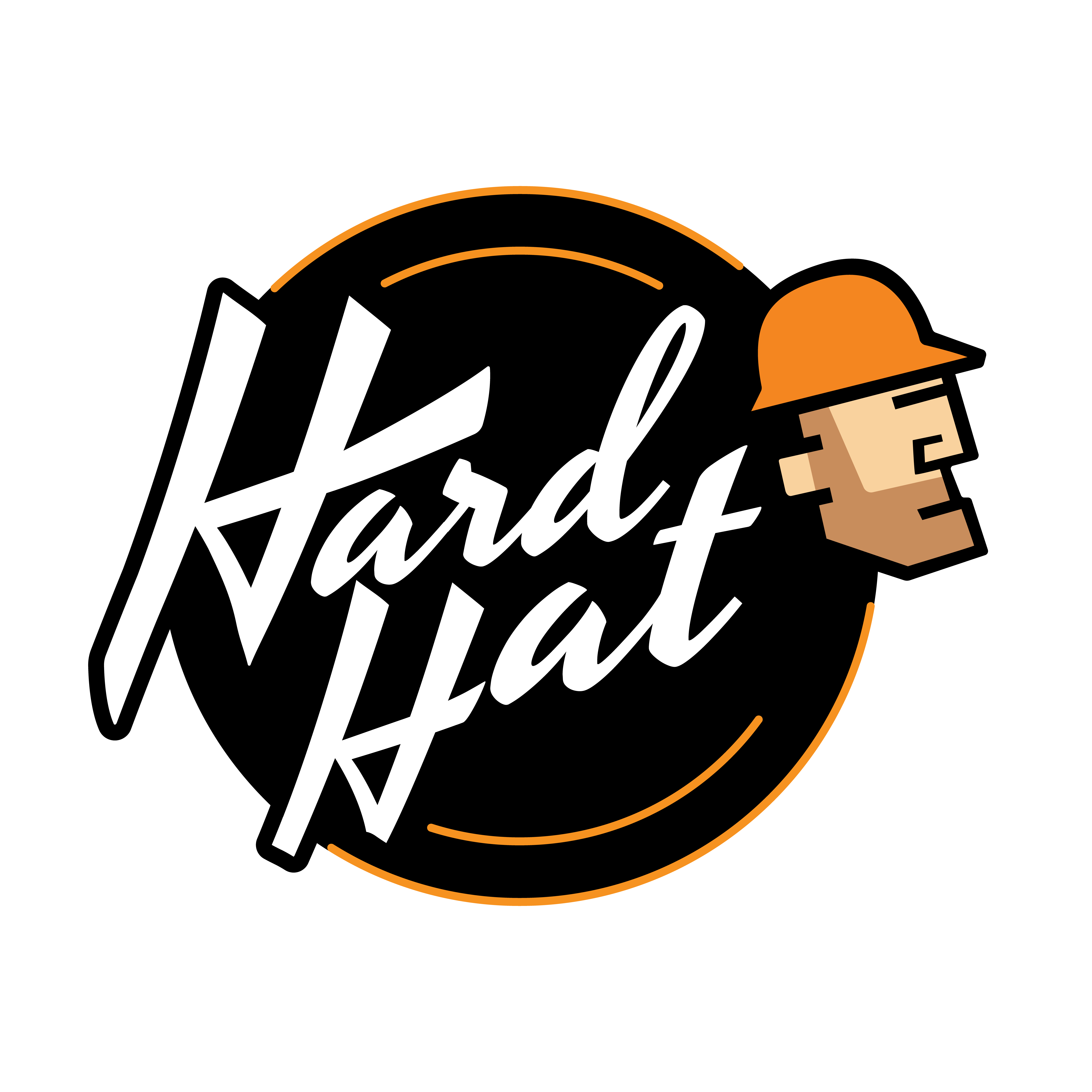 |
| When using either the primary or variation logo on a white background, you will need the logo with the black outline so you can see the end of the H. | |
| White Watermark Logo | Black Watermark Logo |
 *gray background added for this article only |
 |
| Use these when the regular logo doesn't provide enough contrast or fit the aesthetic of the content you are working on. Only use these logos with opacity levels between 25% and 75%. | |
Additional Logo Variations
 |
 |
 |
 *gray background added for this article only *gray background added for this article only |
| Hard Hat Training Favicon | |
|
The favicon should fit nicely within a perfect square. This allows it to have enough breathing space and prevents the content from looking messy. Always ensure there is enough space around the favicon. |
Do not alter the favicon in any way. This includes changes such as:
- Altering the colors or opacity
- Rotating it
- Editing the lines and shapes
- Alter the size or aspect ratio
Hard Hat Training Canada
| Primary Logo | Variation Logo |
 |
 |
Safety Provisions
|
Primary Logo |
|
 |
|
|
Variation Logos |
|
 |
 *gray background added for this article only |
The black and white variations provide a striking alternative when the colored options lose design appeal (such as when the background is already green or blue). Never fill in the blue and green colors on a logo when the words are written in white.
| Safety Provisions Favicon |  |
| The favicon should fit nicely within a perfect square. This allows it to have enough breathing space and prevents the content from looking messy. Always ensure there is enough space around the favicon, whether it is used with or without the words. |
Ag Safety Training
| Primary Logos | |
|
|
|
| Variation Logos | |
 |
|
 |
 *gray background added for this article only |
*Anytime you need to use the watermark, you will use the white cut out as shown in the upper right hand corner.
| Ag Safety Primary Favicon | Variation | Variation |
 |
 |
|
The favicons should fit nicely within a perfect square. This allows it to have enough breathing space and prevents the content from looking messy. Always ensure there is enough space around the favicons.
Med Safety Training
| Primary Logo | Variation Logo - Black | Variation Logo - White |
 |
 |
|
| Med Safety Favicon | |
| There is one primary favicon, and it is the logo without the words "safety training." |

Comments
0 comments
Please sign in to leave a comment.