There are a lot of elements to know about good design, but we trust that you already know most. This article is simply an opportunity to look over some important principles of design we use in our graphics. It also gives you the chance to see some of the graphics our team has created in order to give you a good idea of how design principles have been implemented.
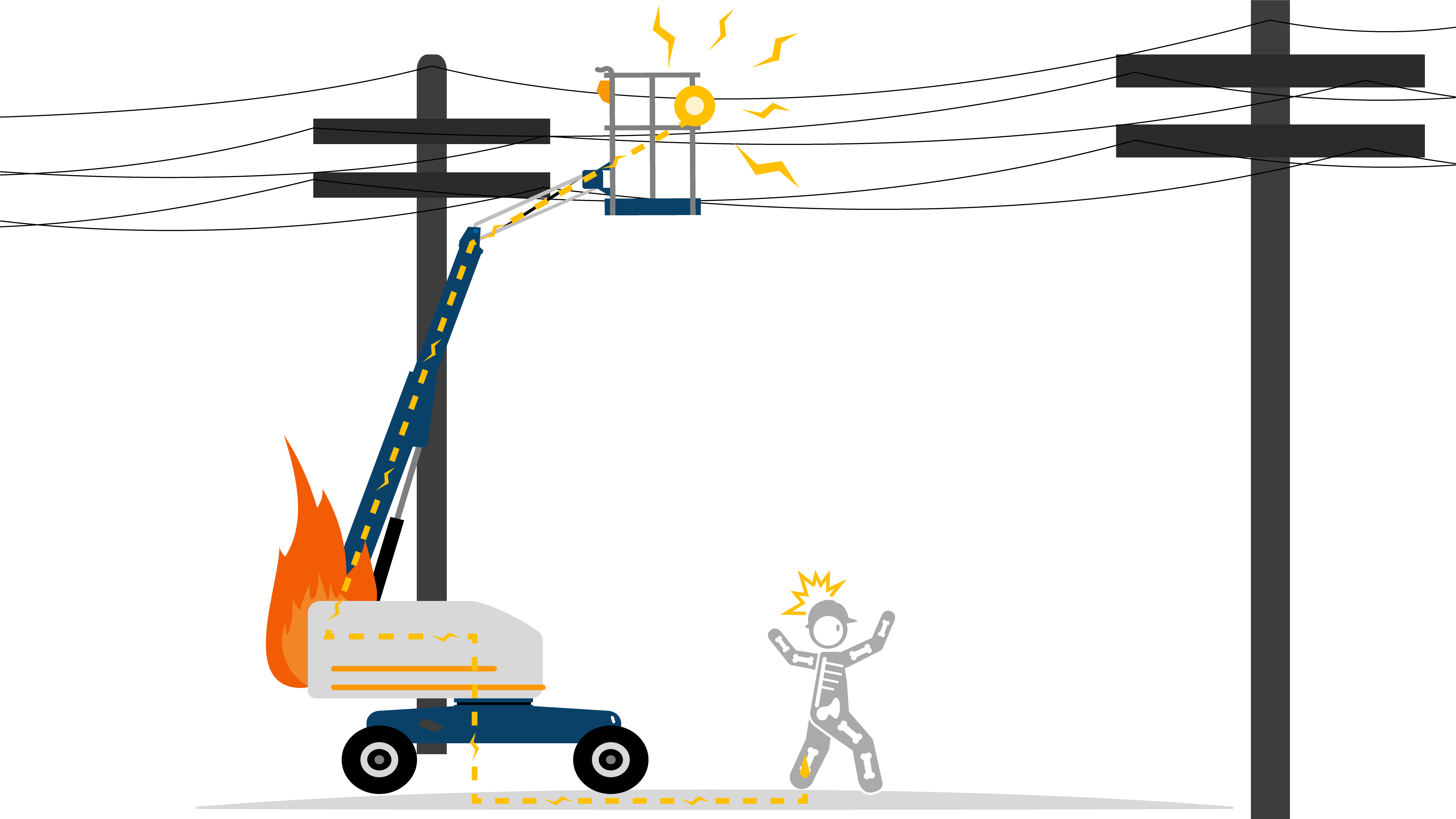
ProportionsProportion is the relationship between two or more elements in a design. This mostly applies to size. Always ask yourself, do the sizes of the machines and the sizes of the employees make sense? |
 |
BalanceVisual balance is about ensuring your graphic is equally weighted on both sides of the central point. Ask yourself, would my graphic be leaning one way if it had physical weight? |
 |
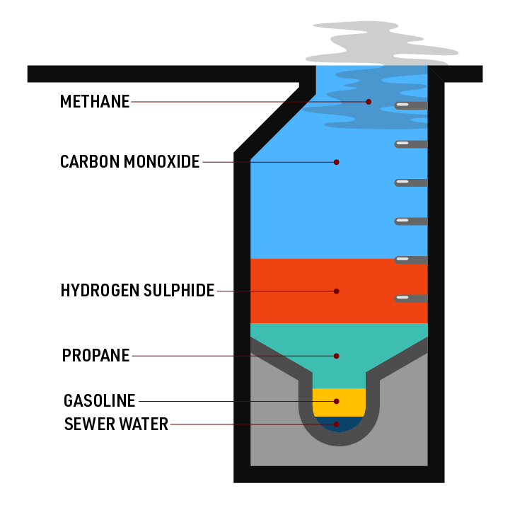
ContrastContrast is when something looks different than another element in the design. To the right, there are lots of contrast between the different colors. Contrast applies to more than just color though, you should have contrasting shapes, layouts, textures, and fonts.
|
 |
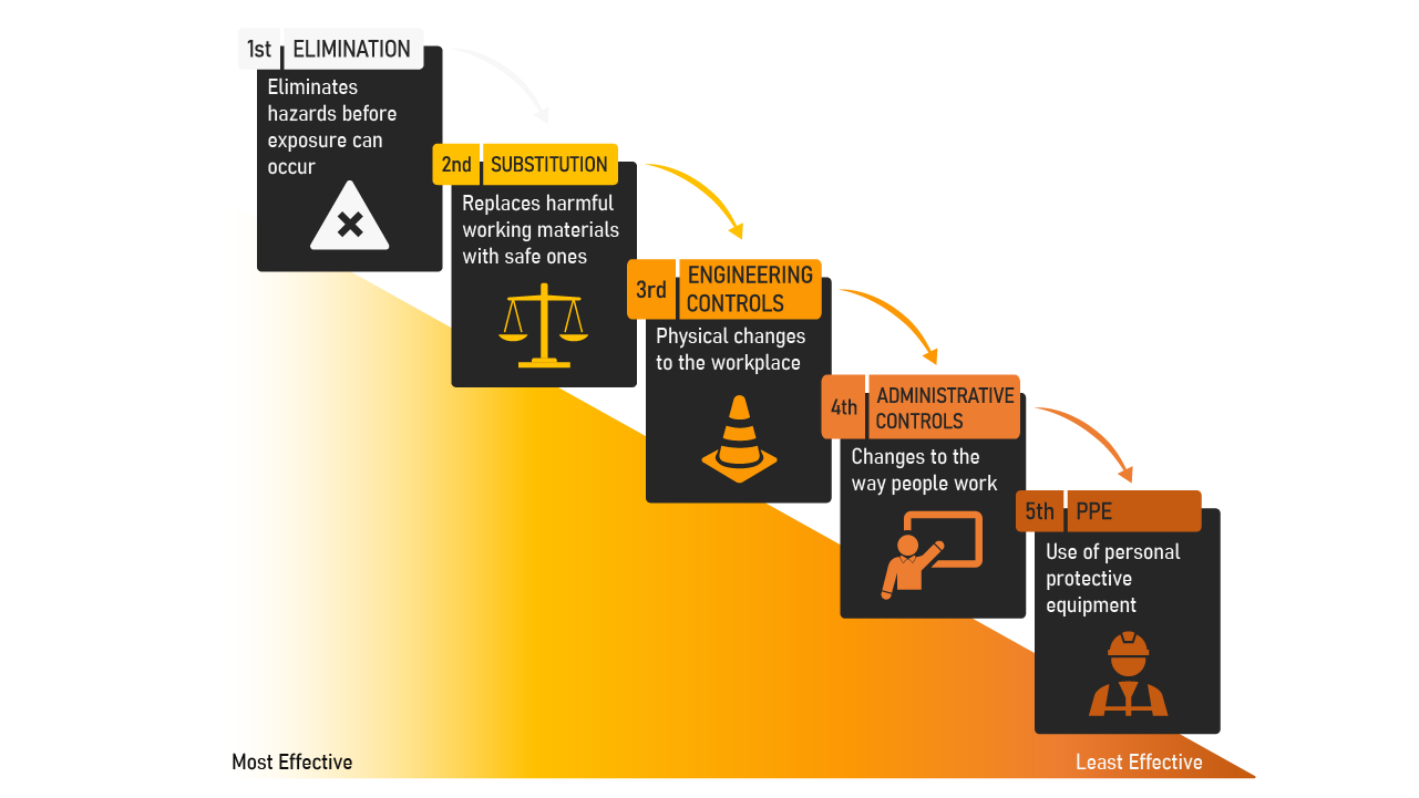
RepetitionRepetition is when an element is repeated over and over to provide consistency and allow the reader to sense what is coming next and understand the logical flow of a design. Repetition is also essential to brand identity and recognition. This graphic of the hierarchy of controls allows the reader to logically progress through a repeated image. |
 |
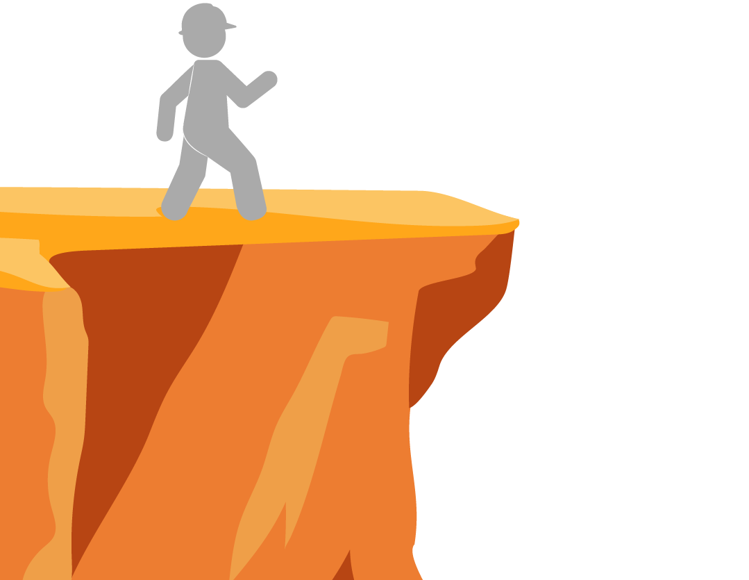
DepthDepth is being able to perceive the world in three dimensions. It is being able to see distance and shape inside of a graphic. Being able to add depth to graphics provides the viewer with a greater perspective and understanding of what you are trying to portray. By using highlights and shadows in the graphic to the right, we are able to perceive the depth of the cliff. |
 |
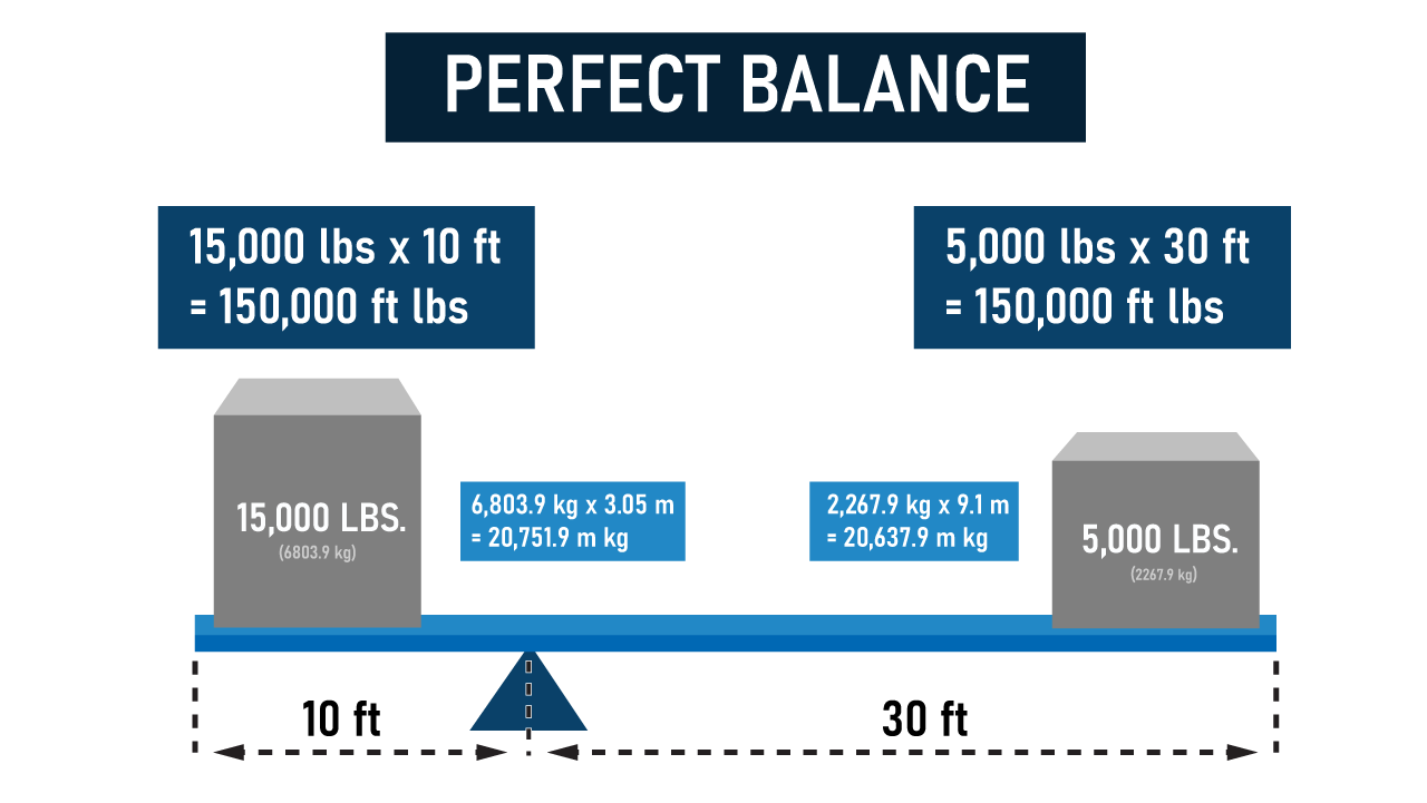
ColorsUsing colors that complement and work well together is important. While we do have colors suggested in our style guide, additional colors that you use should be visually pleasing and not overbearing. The colors in this graphic are all shades of blue, with some gray. These work well together to emphasize different parts of the graphic. |
 |
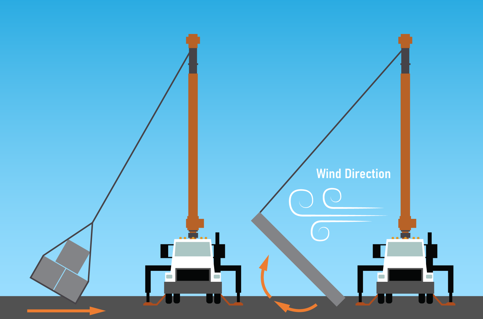
MovementMovement in visual design is the path that the viewer's eye takes through the graphic. It can be made with lines and edges, as well as repeating patterns or objects. With the arrows and wind in the graphic to the left, we see movement. We also follow a path of movement from the truck, up the boom, and then down to the load. |
 |
HierarchyVisual hierarchy is the principle of arranging objects in a way that shows the reader which is most important. When creating graphics, place things in a way that makes a visual hierarchy. A list is a perfect representation of hierarchy as a person would logically start reading at the top, and work their way to the bottom. |
 |
Comments
0 comments
Please sign in to leave a comment.